What Are Dark Patterns?
Dark patterns, also known as deceptive design or deceptive patterns, are essentially tricks. Websites and apps use dark patterns to manipulate users into making decisions they wouldn’t have otherwise made—like subscribing to a service you won’t use, agreeing to marketing emails you didn’t want, or giving up your personal data.
Businesses and consumers alike need to be aware of these patterns. Knowing how to recognize dark patterns means you’re far less likely to fall victim to one or to unintentionally introduce one in your own organization’s website or app.
Why Dark Patterns Matter
It can be tempting to take the stance that using a few dark patterns in a limited way can benefit your analytics without hurting the consumer. Who cares if the “Reject Cookies” button isn’t quite as high contrast as the “Accept Cookies” button?
Unfortunately, that isn’t the case; and even if it was, there would still be compelling reasons to avoid the use of dark patterns.
The biggest and most obvious reason to avoid dark patterns is because they’re noncompliant with major laws. The GDPR, CPRA, COPPA, and FTC Act—a veritable alphabet soup of laws—all forbid the use of deceptive design practices in one form or another. Noncompliance with these laws translates into very real financial penalties. In fact, the abuse of dark patterns was the chief reason why French data protection authorities fined Google and Meta the equivalent of $170m and $68m, respectively, in 2022.
But few companies are as high profile as Google and Meta, and many organizations still choose to flirt with noncompliance since they feel too small to catch the attention of regulators. Never mind that regulators have demonstrated that this is not the case many times over; using dark patterns also annoys your customers. Over time, that poor customer experience translates into mistrust in your brand and loss of revenue.
Last but not least, the use of dark patterns is just plain unethical. In a time when more and more companies are waking up to the necessity of social responsibility in business, exploring ESG factors, and becoming B-Corps, customers are looking for businesses whose ethics are consistent with their brand.
The Science Behind Dark Patterns
Human beings are lazy thinkers—and we have to be. If we took no shortcuts and cut no corners, then we’d be stuck in analysis paralysis 24/7.
These shortcuts are called heuristics, and they often quickly take us to the general vicinity of the correct answer.
As an example, the availability heuristic refers to our tendency to put more weight on easily recalled events rather than difficult-to-recall events. Since shark attacks are big news stories, people tend to overestimate their frequency due to the availability of news stories about shark attacks, rather than their actual likelihood.
Most of the time, heuristics lead us to the approximate right answer. But because they are shortcuts, they have inherent gaps between their process and a rigorous, logical approach to problem-solving. These gaps are called cognitive biases. In the context of dark patterns, these biases can be exploited to manipulate heuristic-dependent, lazy thinkers (i.e., human beings) into acting against their own interests.
An option is preselected on a pop-up, so it must be the correct and desirable choice; one button stands out more than the other, so it must be the right one to click; a notice uses confusing language, so it’s probably not important—this is how dark patterns exploit heuristic thinking and cognitive biases to influence website visitors’ behavior.
9 Dark Pattern Examples
In reality, researchers have identified about 16 different types of dark patterns. Many of these patterns, however, deal with purchases, subscriptions, and other commercial transactions. When it comes to data privacy, we generally see nine dark patterns in the wild.
1. Confirm-shaming
Ever had a cookie pop-up beg and plead with you to accept cookies, almost as though you were hurting somebody’s feelings by rejecting cookies? That would be confirm-shaming, in which the user is emotionally manipulated into performing some action they would not have done otherwise.
2. Forced action
A forced action dark pattern forces users to do something undesirable in order to achieve what they want to do. For example, if you want to opt out of personal data collection, an app might force you to take a survey first in the hopes that you’ll give up.
3. Hard to Cancel
A hard-to-cancel pattern is exactly what it sounds like: it’s easier to opt into data processing than it is to opt out. It’s pretty common in cookie popups—you might need to make one click to accept cookies, but multiple clicks to opt out.

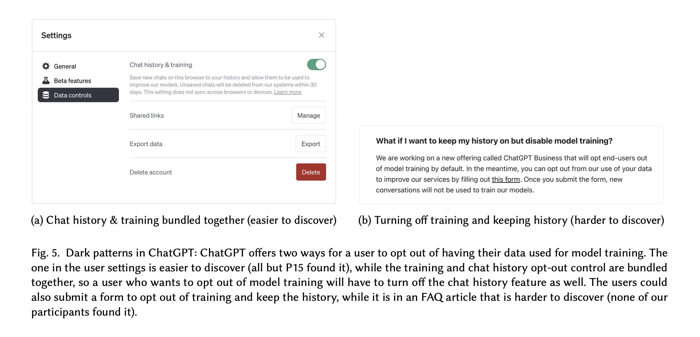
This example of a dark pattern combines features from the Forced Action and Hard-to-Cancel patterns. In order to disable data collection when using ChatGPT, users are forced to also turn off their chat history. Alternatively, they would have to search for a hard-to-find form to submit an opt-out request. (Source: "It's a Fair Game'', or Is It? Examining How Users Navigate Disclosure Risks and Benefits When Using LLM-Based Conversational Agents. (2023) https://doi.org/10.48550/arXiv.2309.11653)
4. Nagging
You might want nothing more than to access a website or service, but every time you navigate onto a new page, you’re asked for your consent to data processing again and again—that’s nagging.
5. Obstruction
Similarly, obstruction patterns make it difficult for you to achieve your desired goal. A mobile app or website might become deliberately slower if you opt out of data processing, for example.
6. Preselection
Another common dark pattern, preselection patterns present a preselected “default” option, which may or may not be in your best interest. If a cookie banner pre-ticks the box for Accept All Cookies, then the preselection pattern is at play.
7. Sneaking
And of course, there is out-and-out trickery. You might not be given the relevant information to make an informed choice regarding data processing. For example, you might be told that your personal data is only used for analytics purposes, but it is in fact sold to third parties.
8. Trick Wording
Alternatively, the language used to convey important information could be vague, unclear, and misleading. Perhaps that cookie banner does mention that your data will be sold to third parties if you agree, so long as you read between the lines.
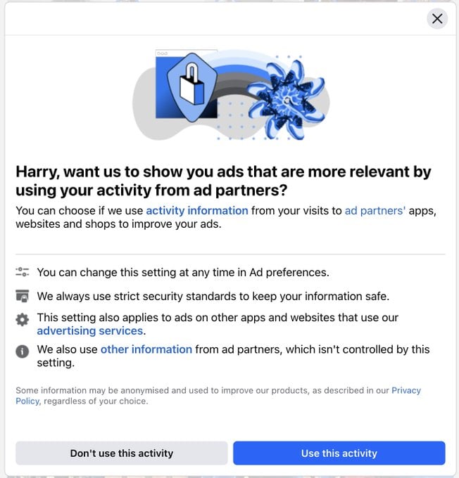
 This dark pattern comes from Facebook. Note the language on the buttons—"Use this activity" seems much less clear than "Agree to Data Collection" or "Agree to Targeted Advertising." Thus, this is a subtle example of a trick-wording pattern. (Source: Deceptive Design Hall of Shame)
9. Visual Interferences
If there is some information or action the business doesn’t want you to take, it can always just do its best to hide it. The visual interference pattern is at play when opt-out options are in low contrast, privacy policy links are in two-point font, or when vital information is otherwise obscured.
You Don’t Need Dark Patterns to Be Successful
As we described above, there are plenty of ways that the use of dark patterns hurts your business—whether that’s through regulatory fines, a poor customer experience, or through friction with your brand values.
But even if these weren’t factors, dark patterns aren’t significant sources of value. If anything, avoiding dark patterns generates a return on investment. While clear and transparent data processing practices are just one element of a customer experience, one study found that businesses that were considered customer experience leaders generated 3.4 times the return on stock value compared to customer experience laggards.
And although transparent design practices might mean a higher rate of opt-outs and less personal data to sell and analyze, this is ultimately just another shift in the dynamic business intelligence environment for most companies. There are always more levers to pull, different channels to explore, and new ways to succeed. The only surefire way to fail in the face of change is to resist it.
Businesses that recognize this truth use trusted data privacy platforms like Osano to manage their data processing activities. Between its globally compliant cookie consent management, streamlined DSAR workflow, and overall enablement of a robust data privacy program, Osano can enable transparency and authenticity in your data processing activities.
Schedule a demo today to see how Osano can support your privacy program.
Free CMP Scorecard
Interested in evaluating consent management platforms, but not sure what questions to ask? Use our scorecard to help inform, guide, and track your evaluation process.
Download Your Copy
Matt Davis, CIPM (IAPP)
Matt Davis, CIPM (IAPP)
Matt Davis is a writer at Osano, where he researches and writes about the latest in technology, legislation, and business to spread awareness about the most pressing issues in privacy today. When he’s not writing about data privacy, Matt spends his time exploring Vermont with his dog, Harper; playing piano; and writing short fiction.
.webp?width=1220&height=1090&name=Osano-guarantee-seal%20(1).webp)


